Three weeks ago Google announced on the Analytics blog that a new interface was available to use for some accounts, I’m not sure if it’s been rolled out across all accounts or if I was one of the lucky few who are able to use the new one, either way here is what you can expect from the new interface!
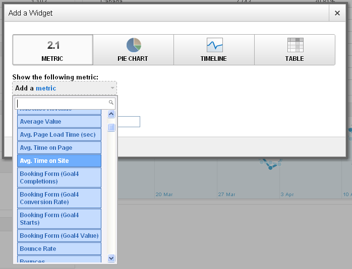
One of the main features to get excited about is a brand new dashboard which you can customise with as many widgets as you want displaying almost any metric, pie chart, timeline or table.
But it doesn’t allow you to add custom reports to the dashboard, which is a step backwards for an ‘upgrade’ however the new interface is still in BETA so Google Engineers may still add this feature.
Another feature I found useful that has disappeared is the ability to export as a PDF. The only options available now are CSV, TSV and CSV for Excel.
The content section has been changed, so instead of looking at a Top Content report you can see a pages report, which has a navigation summary tab above the time line graph which shows where users navigated from to get to that page and where users navigated to when they left that page (think of it like a non-graphical in page analytics).
This enables you to track the most popular routes users take to get to goals on your site.
Overall I’m impressed by the new interface hopefully some of the currently exclude features will be added when a full release is ready.
