Tag Archives: Google

Approved (limited) – Human form and contact in Travel

Little quiz for everyone – picture below has been marked based on Google Policy Approved (Limited) Human form and contact - current bullet point 6 (the last one). Is this correct?

Based On Skin - Approved Limited

Approved (Limited) – Skin Exposure?

The policy states:

“Image ads showing tight clothing or exposed skin in areas including, but not limited to, midriff, thighs, and shoulders will be marked “Approved (limited).” Affected ads include ones that show real people or cartoons/animations with exposed skin or tight clothing that give an indication of breasts, buttocks, or genitalia, and ads in which adult human forms are in bodily contact. These ads won’t show on certain Display Network sites if publishers opt out of showing such ads.”

These especially words: “areas including, but not limited to”, create situation in which if Google wants Google can put any image ad with human being into this category. At this point publishers, bloggers may consider it “dangerous” and not allow to publish on their blogs. If you run religious portal about pilgrimage, you may not like kissing people in swimsuits on your website. Of course, you do not want to give space to any explicit content but… would you object to an ad like this? If you’re a regular travel blogger your approach might be the same. You do not want to have “sexually suggestive” content, but you want some money. After all you’re writing about Hawaii travel adverts on your blog.

Another view is that someone simply does not want some smiling people with open mouth, and white teeth on their website (fair enough) and I can also understand this but at this point Google’s own policy is a bit of a sham. The policy effectively classifies my guy on a bike as “sexually explicit” by putting him into one category with “Affected ads include ones that show… exposed skin or tight clothing that give an indication of breasts, buttocks, or genitalia”.

Is my guy offending anyone? Perhaps yes, but should he be in this same category as picture of tight clothing that exposes genitalia? Not that I can guarantee his jaw-drop is not a naked photographer and his hands are not on the handles of a bicycle but somewhere else ;-) but this I will leave to your imagination. Drilling this further you can arrive with another thought – maybe in this case Google tries to “Approve (Limit)” our imagination 0-(*)!?

Oh, Google if you create rules make sure they are precise as now we have a clear indication that you can moderate not only your natural algorithm, but limit advertising of companies by placing their ads into statuses that are not necessary clear to explain.

Of course what can you do when you’re up against mighty Google – we allow a company to expand to the size where only some anti-corporate regulation could break it up into pieces that would stop them effectively creating their own ineffective and sometimes very poor focused on revenues “laws”.

Let’s not forget travel industry itself which uses a lot of human bodies in their advertising. It is the industry that contributes plenty of money to Google’s revenue. We also know Google is after this market with their attempts to introduce flight search and other vertical travel searches. Is this one of the steps to take a bite from Expedia-like companies? Or they were threatened with legal action by religious groups?

For some reason, we do not believe they are afraid of excommunication after 15 years of ”Don’t be evil” policy :-P .

Let us know if you have more interesting info or pictures of undeserved statuses. Also if, you’re publisher within the Google Display Network you can shed some light on this from your perspective?
Google, Google Everywhere…

It looks like we’ve had a lot of celebrations in September mainly due to the 15th birthday of our global search giant. Although looks like even Google was confused as to when their actual day of birth was, as nicely pointed by Andrea Peterson in her recent post.

As I write this article the last candles on Google 15th birthday cake have already melted icing and I suppose this is good sign to start looking forward to see where we go from here.
From pretty basic search engine which delivered results to Yahoo! in last century Google Inc. changed into formidable powerhouse of technology and data.

The question we are facing is Googlenet a day to day reality?
We do not “search it” any more we “Google it”. Google’s presence is so strong in our society we have mainstream media delivering information about the Hummingbird update making it more relevant for “BBC Hummingbird” query than some of David’s Attenborough videos actually featuring bird itself  (I won’t mention cakes results).

Of course there was a moment in our history when the only “hoover” we could buy was a Hoover and the only “kleenex” was from Kleenex but we’ve long forgotten about these times. It is a huge marketing success of any brand to deliver this linguistic change but times change and when we now proudly announce after coming back from shopping that we purchased a Dyson hoover, however this does not produce money for Hoover. Google of course is in the same situation Hoover was 60 years ago. We know there is a limited time you can carry on buying platforms and blocking technology. It is just matter of time. Who will be next?

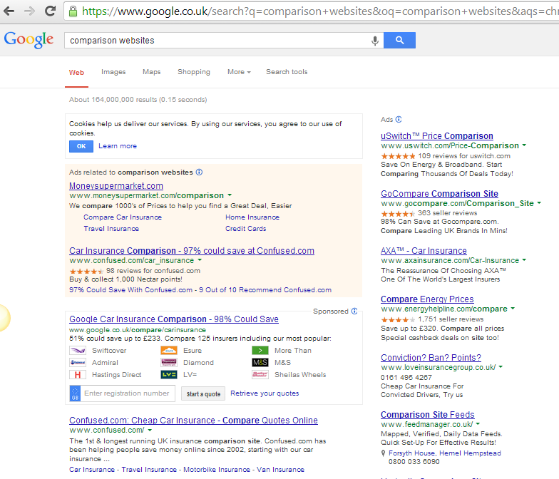
At this moment Google, the seemingly invincible search giant looks to have taken over the world, but we believe a race to deliver more profit will create first slips in their iron-like grip of the world’s information delivery system. We move from services people used to love to infantilization and full commercialism. The Google graveyard grows bigger and bigger while at the same very poor money orientated services make their way online and top Google results. But touching someone’s business may create reverse industry actions. What interest have for example comparison websites to spend millions with Google AdWords  if Google decides to open its own comparison service?

Google Comparison Services

New Nav Bar Layout For Google SERP’s

Too Long Google Sidbar Recieved Complains from Users earlier this year

Too Long To Cope With New Features - Google Side Bar Navigation

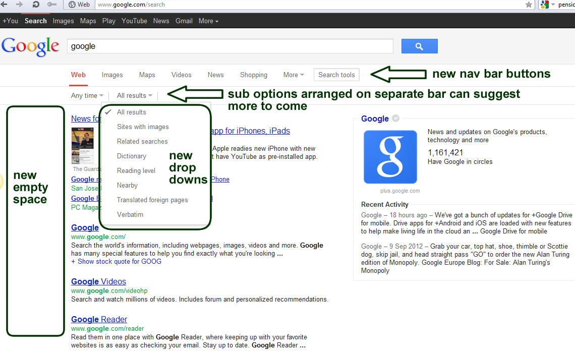
Earlier this month we spot Google again started testing new possible update to SERPs (Search Engines Result Pages) usability and structure. As previously this testing is not yet visible to everyone but we can perhaps expect it to be visible across all Googles within next few weeks (possibly with some modifications).
Switching Navigation from Left hand side bar to the top bar may suggest several things:
1) Google follows trends and decided to simplify some elements of navigation (current options for search criteria has been summarised in “Search Tools” button and they allow to tick options.
2) More products (search options) which popped up earlier this year created situation where side bar navigation become too long and not that useful. When you tried to open tab “More” and “Show Search Tools” you would need monitor with more then 1000px height res to see all options. “Applications” become for good part of the main navigation – obviously they create revenue for company and long awaited Flight Search looks like made its way from Beta to full release (maybe not yet as Error 500 is not what you expect from link on main Google Nav Bar :-( see more of this story here.

3) left hand side bar is now ready for new task – empty and wide enough to generate some revenue can be easily used for advertising or more push of google products like Chrom or G+ results also it is another space which could be used by AdWords let see.
G+ results make a lot of sense in this position as we have seen in the past them being on right hnd side where briefly they were replacing AdWords for some ad free but popular search terms.

The whole exercise with new layout testing suggests Google similar to other giants struggles with navigational expansion. These changes are made just few weeks after Amazon introduced their new sliding expandable navigation. All these companies need to deal with several layers of navigation from User specific/Account functions navigation through Products/Services Navigation and Functional/options navigation this creates a lot of navbars and buttons and the last thing they want to do is overcomplicated layouts. Perhaps we will see soon some ground braking propositions to keep all this functionality in place but at this same time to create some standardise systems to keep users happy.

One of these recent attempts to improve experience on multi level navigation we can see below:


In the past we also struggled with these type of navigations but we made good progress few years ago while we developed http://www.surrey-online.co.uk/ and Top-Content based websites .


G+ in vanilla search results on Google UK!

There it is!

I might have missed this by couple of days but I must admit I have never seen this type of layout within UK results.

I consulted this with my colleagues and it looks like this is the very first appearance we noticed!
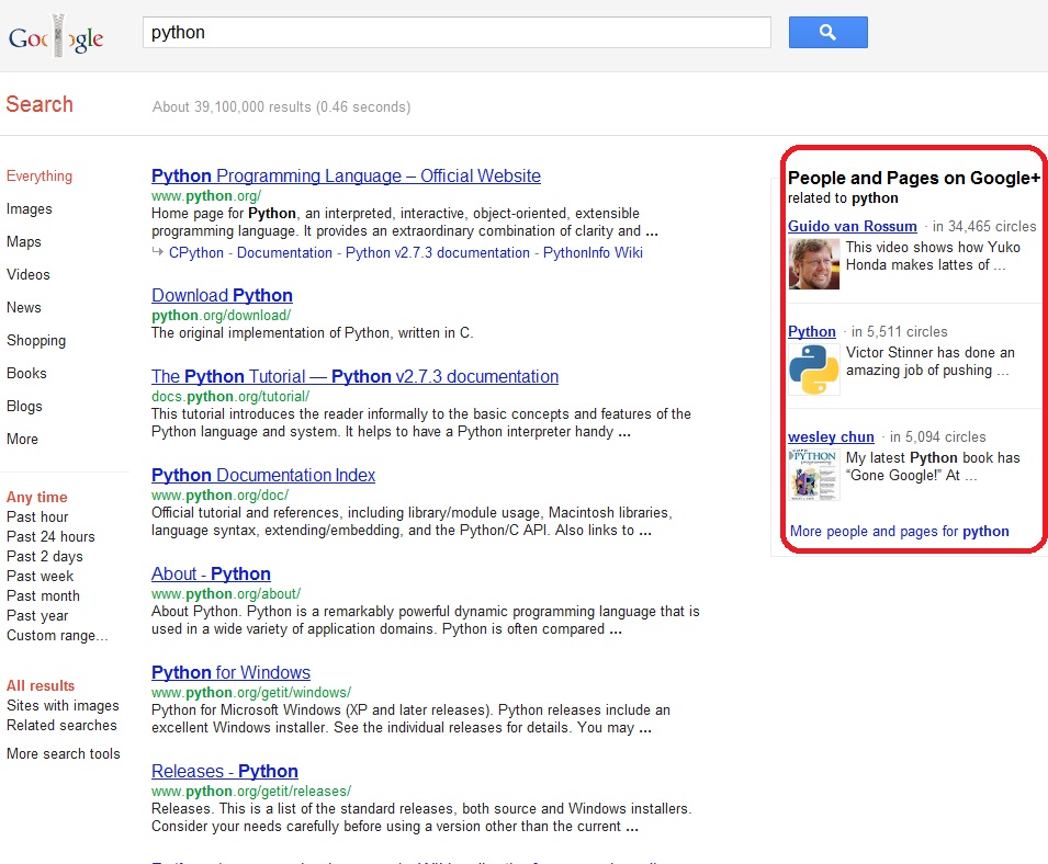
We are always asked by customers how to identify influencers among this vast numbers of bloggers and social media based publishers? Not waiting for twitter, facebook or any other platform Google decided to tell us this very clearly. Google’s paraphrased message is simple

“we (Google) believe people who use very strongly and promote Google social media product G+ are these people who are the strongest influencers on the market for any given subject.”

In this case three “Python” coding language related accounts/pages are promoted within space usually used by AdWords (not that I was looking for Python.org but give or take “mind reading by Google” is not scheduled for release until late 2014:-)
I’m telling you – Average Joe and Plain Jane get your circle sorted ASAP!
New Social Search is here in UK fully implemented form now onwards

The World Waves Goodbye to Google Wave

Google Wave is DeadGoogle has now officially announced the end of Google Wave. Google has sent out emails to all users informing them that as of 31 January 2012 Google Wave will be read only and it will be turned off on 30 April 2012. If you want to continue using Wave there is an open source project called Walkaround that allows you to import all your waves from Google.

It was announced back in August 2010 that due to it’s lack of user adoption, mainly because Google tried to replace two perfectly good products that don’t need to be merged or improved, e-mail and instant messenger. While it was a useful messenger meeting tool I’m led to believe most users just played games and shared memes with it!

Now Google is preparing for the wave of the future Google+!


Listings with links – Further Expansion – Google’s yet another update…

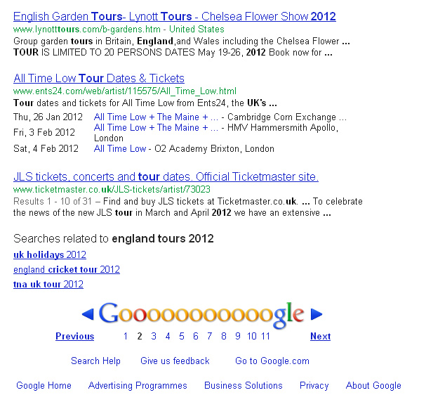
As we reported recently Google introduced bullet lists in Search Engines Result Pages  - few weeks in to the future and Google is again showing new features. This time well on the way to make SERPs even more accurately targeting people to relevant landing pages:
Bullet Points, Calendars of Events… – All to speed up search process.

Google Search Results Another Types of Links

SERP more Links for Listings

Google’s idea to change SERPs into a one stop shop and create habit of using more then ten text blue links gets another dimension. This time more accurate landing pages from one listing
In the case of the picture attached – FOUR in ONE

Yes, I must admit when Google in order to create more control over our behavior changed Google Accounts system I thought they were a proper bunch of lunatics as this change just upset a lot of people and made huge steps towards Googlnet which put tools in hands of Google opposition frightened by power of manipulation and behavior tracking.

However these latest SERPs changes prove there is still a strong search division in the biggest Search Engine in the world not only bunch of marketers analysing vast amounts of user behavioural patterns and forcing their implementations to modify pure algorithmic SERPs.

Yes this is true, In this huge corporation there are very few guys left who are focused on search algorithms,  search quality etc. These days most of the people involved are – Customer Support people, money collectors  and sales in call centers and in other offices  - no different to a high street bank

The Google+ Project (Googlebook?)

Google began testing their new product Google+ today. Only a small number of people were invited for testing… I wasn’t one of them :(

I did however take the interactive tour of Google+ and I’m pretty excited about some of the features it has to offer.

Google+ Circles:

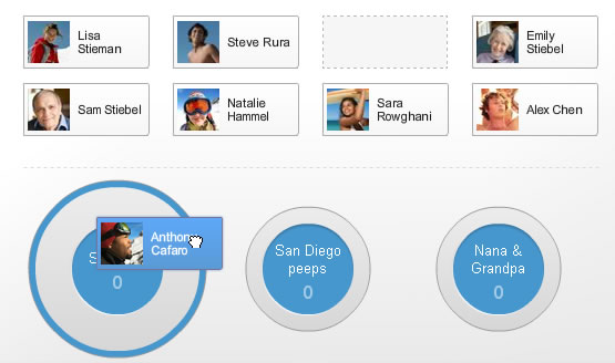
Similar to Facebook friend groups you can add your friends to different “circles” so you don’t share stuff with your parents (or boss) that you don’t want them to know!

Google+ Friend Circles Feature

Just drag and drop!

Google+ Sparks:

Sparks sounds like the ultimate boredom killer (unless you have no interests). You add topics, categories or any other interests and Google+ sparks will find videos and articles it thinks you might like… Cool, but a bit stalker -ish.

Google+ Hangouts:

This is probably the coolest feature of Google+! It allows yo to have video conversations with your friends. You can limit it to particular friends or have an open “hangout” where anyone you know can join.

Each participant has a small video at the bottom and the person who is talking (or talking the loudest) has the main video at the top.

Google+ Hangouts Video Feature


There are also some mobile specific features Google+ has.

Mobile Google+ Instant Upload:

Take a photo and it can be instantly uploaded to Google+ into a private photo folder, then you can put it into whatever folder you want later. This is convenient but a bit worrying if you take photos you don’t want to appear on the internet EVER!

Mobile Google+ Huddle:

This is very similar to Facebook chat however, it allows whole Google+ Circles to participate in the chat rather than just single participants. This sounds like a pretty good feature if it works well… I can never get Facebook chat to work on my phone :(

All in all I’m pretty excited about Google+ when I’m finally able to use it :P

What do you think? Were you one of the lucky few signed up to use it? Let us know in the comments!

New Google Black Layout for 2011 – Google turns to the dark side!

Google has been testing a new black naviagtion bar with a grey search bar background.

As per any change that occurs on the internet users are complaining. They claim that the new black navigation bar ruins their custom Google homepage.

New Google layout 2011
Click for larger image

Google is always testing new positioning, colours and many other slight changes to all their services, this one is just one of the most noticeable visual changes this year.

If you’ve seen it let us know what you think of the new Google layout. Did it ruin your custom Google homepage?

The Chromebook is Finally here!

Ok so it’s not here right now, but if you live in the 7 selected countries you could get your very own shiny new Chromebook on the dates listed below.

  • US 23rd June
  • Germany 24th June
  • France 24th June
  • Netherlands 24th June
  • Spain 22nd July
  • Italy 25th July
  • UK 1st July

There are two Chromebooks being released, one by Samsung and one by Acer, check out the specs below:

Samsumg Acer
OS Chrome OS Chrome OS
Display 12.1 (1280×800) 300 nit Display 11.6 HD Widescreen CineCrystalTM LED-backlit LCD
Weight 3.26 lbs/1.48 kg 3.19 lbs | 1.45 kg
Memory 2 GB RAM, 16 GB solid-state drive (SSD) 2 GB RAM, 16 GB solid-state drive (SSD)
Battery 8.5 hours of continuous usage* 6 hours of continuous usage*
Processor Intel® AtomTM Dual-Core Processor Intel® AtomTM Dual-Core Processor
Connectivity Built in dual-band Wi-Fi and World-mode 3G (optional) Built in dual-band Wi-Fi and World-mode 3G (optional)
Webcam HD Webcam (1-megapixel) HD Webcam
Audio Built-in stereo speakers, combo headphone/microphone jack High-Definition Audio Support
Peripherals 2 USB 2.0 ports, 4-in-1 memory card slot, Mini-VGA port 2 USB 2.0 ports, 4-in-1 memory card slot, HDMI port
Input Full-sized Chrome keyboard, Oversized, fully clickable track pad Full-sized Chrome keyboard, Oversized, fully clickable track pad

*Engineering specs can change without prior notice. Battery times are estimates, depend on lots of different factors and may decline over time.

The Chromebook is Google’s newest product for those who live only on the internet. Take a look at the video below explaining how the Chromebook works.

You would think that since it’s practically a netbook (with less features) it would cost the same, or less than your average netbook… Think again! The Samsung version with 3G will set you back £399 (£349 without 3G) from PC World or Amazon.

It comes with no programs installed you can only use online apps, which may be fine for some, but what happens when you don’t have any 3G or wifi. The chromebook becomes a very fancy (and expensive) paper weight!