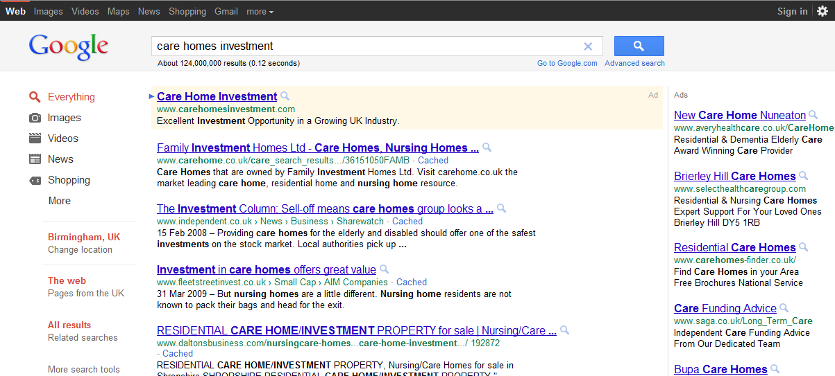
Google has been testing a new black naviagtion bar with a grey search bar background.
As per any change that occurs on the internet users are complaining. They claim that the new black navigation bar ruins their custom Google homepage.
Google is always testing new positioning, colours and many other slight changes to all their services, this one is just one of the most noticeable visual changes this year.
If you’ve seen it let us know what you think of the new Google layout. Did it ruin your custom Google homepage?
