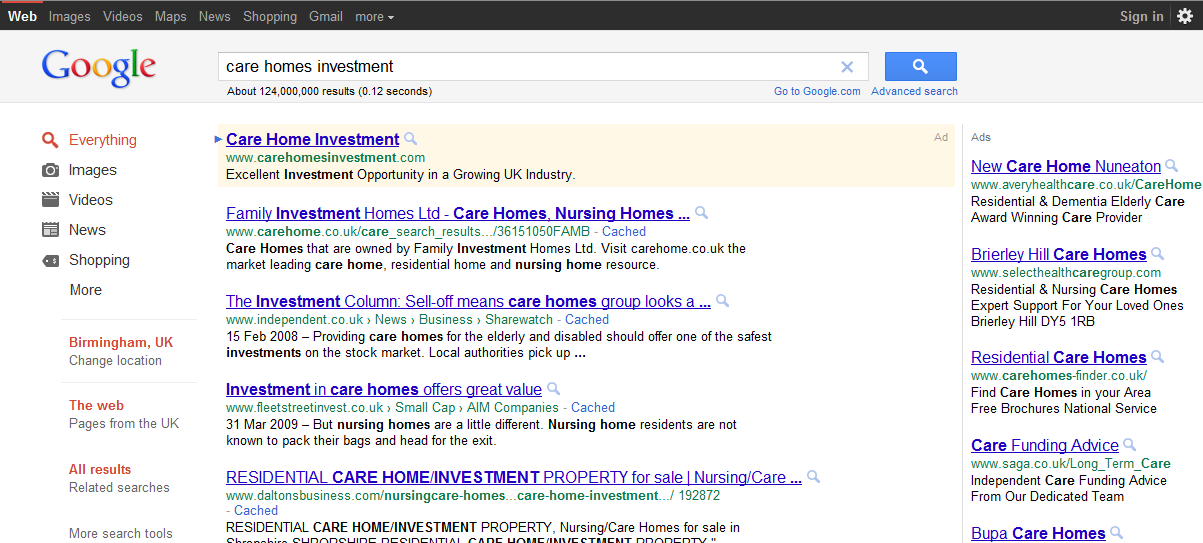
Google has been testing a new black naviagtion bar with a grey search bar background.
As per any change that occurs on the internet users are complaining. They claim that the new black navigation bar ruins their custom Google homepage.
Google is always testing new positioning, colours and many other slight changes to all their services, this one is just one of the most noticeable visual changes this year.
If you’ve seen it let us know what you think of the new Google layout. Did it ruin your custom Google homepage?


I sort of like the old one better. I don’t mind the new one terribly, but I also don’t prefer it.
Love the new layout. Looks beautiful
I absolutely hate the new one, we were alright with the old, at least give an option to revert to the “classic” look.
Ik love the new layout. it looks very cool
The only way Google can screw up and lose the search engine leadership is to make the site worse. Exactly that is happening at the moment.