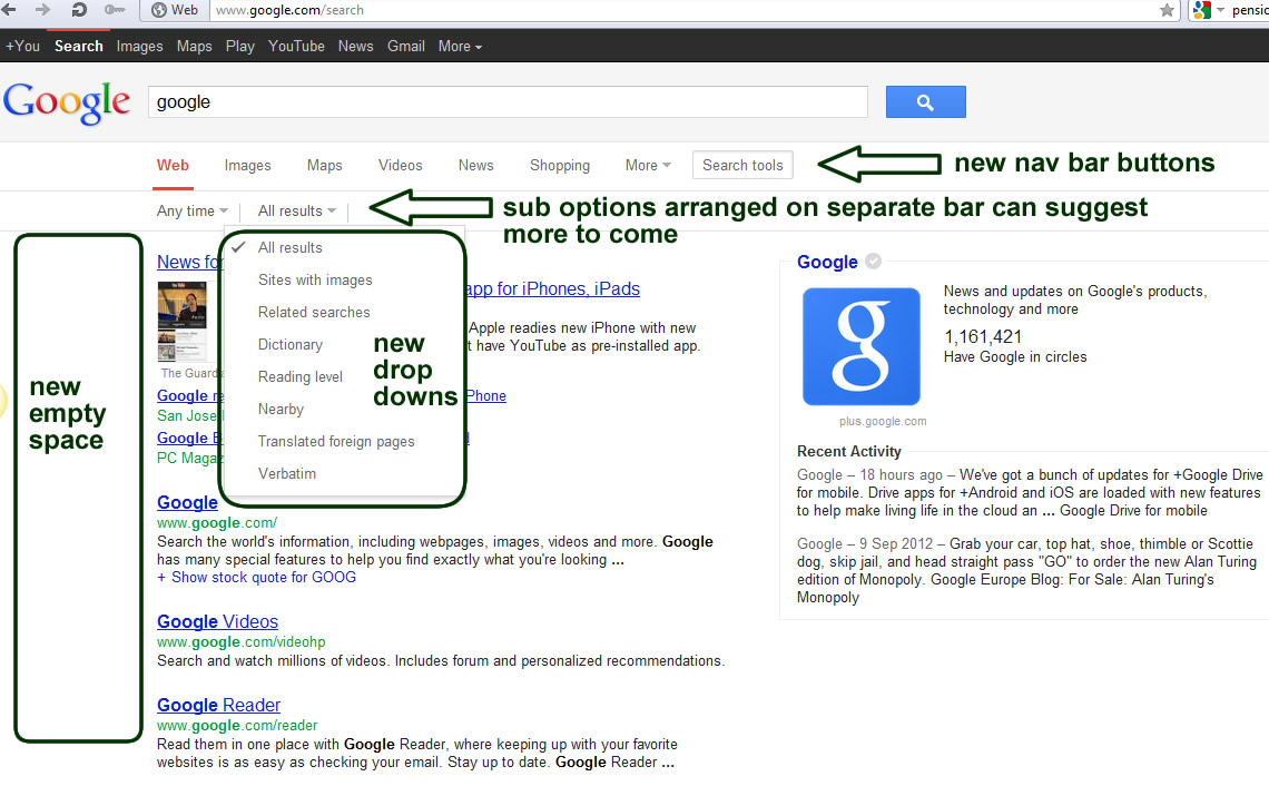
Earlier this month we spot Google again started testing new possible update to SERPs (Search Engines Result Pages) usability and structure. As previously this testing is not yet visible to everyone but we can perhaps expect it to be visible across all Googles within next few weeks (possibly with some modifications).
Switching Navigation from Left hand side bar to the top bar may suggest several things:
1) Google follows trends and decided to simplify some elements of navigation (current options for search criteria has been summarised in “Search Tools” button and they allow to tick options.
2) More products (search options) which popped up earlier this year created situation where side bar navigation become too long and not that useful. When you tried to open tab “More” and “Show Search Tools” you would need monitor with more then 1000px height res to see all options. “Applications” become for good part of the main navigation – obviously they create revenue for company and long awaited Flight Search looks like made its way from Beta to full release (maybe not yet as Error 500 is not what you expect from link on main Google Nav Bar ![]() see more of this story here.
see more of this story here.
3) left hand side bar is now ready for new task – empty and wide enough to generate some revenue can be easily used for advertising or more push of google products like Chrom or G+ results also it is another space which could be used by AdWords let see.
G+ results make a lot of sense in this position as we have seen in the past them being on right hnd side where briefly they were replacing AdWords for some ad free but popular search terms.
The whole exercise with new layout testing suggests Google similar to other giants struggles with navigational expansion. These changes are made just few weeks after Amazon introduced their new sliding expandable navigation. All these companies need to deal with several layers of navigation from User specific/Account functions navigation through Products/Services Navigation and Functional/options navigation this creates a lot of navbars and buttons and the last thing they want to do is overcomplicated layouts. Perhaps we will see soon some ground braking propositions to keep all this functionality in place but at this same time to create some standardise systems to keep users happy.
One of these recent attempts to improve experience on multi level navigation we can see below:
In the past we also struggled with these type of navigations but we made good progress few years ago while we developed http://www.surrey-online.co.uk/ and Top-Content based websites .


