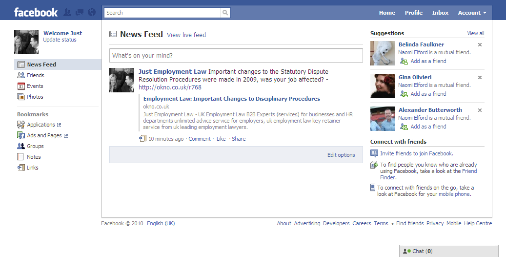
Google might not be the only internet giant making layout changes in 2010 – Facebook seems like it might be getting yet another layout change in 2010. When they tried to change it last year, users were so against the changes that they had to fight to try and persuade people it was a change for the better.
It’s unlikely we’ll see the same kind of resistance from Facebook users this time as the changes seem only very minor, yet still annoying if you’re a firm believer of the saying, “if it ain’t broke, don’t fix it”. However, the changes we’ve seen were pretty good, from a technical point of view at least, because it’s now faster to do some things such as view your message inbox, notifications and requests (the icons of which now sit sandwiched between the Facebook logo and the now rather elongated search bar), which has also been repositioned to the centre.
The changes are in testing and only visible at this moment on certain accounts, which suggests the update may not even happen but it’s likely that we’ll at least hear more about this soon.
Share your thoughts of the first new 2010 Facebook layout – a good or bad start to the new year?
